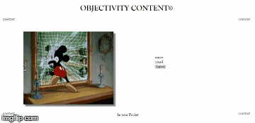
what i trying to do is to hover on content text which is placed on four sides of desktop screen and revealing the all hidden text under (content,In your pocket ).
When hover over words that say “content” or “in your pocket” I want display to hide those, and show the words underneath
Now what i want
All tabs need to reveal when hover over any one of them which means when ever i hover any one of content word all the under underneath text revealed
here is the demo & result: https://imgflip.com/gif/232us3
or livedemo: http://www.objectivitycontent.com/index-b.html
kindly look at the code:
css:
/ .button /
.button {
    display: inline-block;
    position: relative;
    margin: 1em;
    padding: 5px;
    border: 2px solid #000;
    overflow: hidden;
    text-decoration: none;
    font-size: 20px;
    border: none;
    outline: none;
    color: #000;
    background: transparent;
    font-family: "Goudy Old Style", Garamond, "Big Caslon", "Times New Roman", serif;}}

.button span {
    -webkit-transition: 0.6s;
    -moz-transition: 0.6s;
    -o-transition: 0.6s;
    transition: 0.6s;
    -webkit-transition-delay: 0.2s;
    -moz-transition-delay: 0.2s;
    -o-transition-delay: 0.2s;
    transition-delay: 0.2s;
}

.button:before,
.button:after {
    content: '';
    position: absolute;
    top: 0.27em;
    left: 0;
    width: 100%;
    text-align: center;
    opacity: 0;
    -webkit-transition: .1s,opacity .1s;
    -moz-transition: .1s,opacity .1s;
    -o-transition: .1s,opacity .1s;
    transition: .1s,opacity .1s;
}

/* :before */

.button:before {
    content: attr(data-hover);
    -webkit-transform: translate(-150%,0);
    -moz-transform: translate(-150%,0);
    -ms-transform: translate(-150%,0);
    -o-transform: translate(-150%,0);
    transform: translate(-150%,0);
}

/* :after */

.button:after {
    content: attr(data-active);
    -webkit-transform: translate(150%,0);
    -moz-transform: translate(150%,0);
    -ms-transform: translate(150%,0);
    -o-transform: translate(150%,0);
    transform: translate(150%,0);
}

/* Span on :hover and :active */

.button:hover span,
.button:active span {
    opacity: 0;
    -webkit-transform: scale(0.3);
    -moz-transform: scale(0.3);
    -ms-transform: scale(0.3);
    -o-transform: scale(0.3);
    transform: scale(0.3);
}

/*
    We show :before pseudo-element on :hover
    and :after pseudo-element on :active
*/

.button:hover:before,
.button:active:after {
    opacity: 1;
    -webkit-transform: translate(0,0);
    -moz-transform: translate(0,0);
    -ms-transform: translate(0,0);
    -o-transform: translate(0,0);
    transform: translate(0,0);
    -webkit-transition-delay: .1s;
    -moz-transition-delay: .1s;
    -o-transition-delay: .1s;
    transition-delay: .1s;
}

/*
  We hide :before pseudo-element on :active
*/

.button:active:before {
    -webkit-transform: translate(-150%,0);
    -moz-transform: translate(-150%,0);
    -ms-transform: translate(-150%,0);
    -o-transform: translate(-150%,0);
    transform: translate(-150%,0);
    -webkit-transition-delay: 0s;
    -moz-transition-delay: 0s;
    -o-transition-delay: 0s;
    transition-delay: 0s;
}


**/*in your pocket */**

.textanim-container {
  position: relative;
  max-width: 150px;
  min-height: 100px;
  margin: auto;
  border: none;
  overflow: hidden;
}

.textanim-title {
  margin: 0;
  position: absolute;
  width: 100%;
  left: 0;
  right: 0;
  top: 50%;
  transform: translateY(-50%);
  text-align: center;
  font-size:18px;
  transition: 0.3s;
}

.textanim-container:hover .textanim-title {
  top: 10px;
  transform: translateY(0);
}

.textanim-hidden {
  position: absolute;
  top: 400px;
  left: 45px;
  font-size:15px;
  opacity: 0.9;
  transition: 0.3s;
  text-align: center;
}

.textanim-container:hover .textanim-hidden {
  top: 50%;
  transform: translateY(-50%);
}
 <div class="content">
 <div class="top-right"><a href="source.html" class="button"  data-hover="source" >
 <span>content</span></a></div>
 <div class="top-left"><a href="shop.html" class="button"  data-hover="shop" >
 <span>content</span></a></div>
<div class="bottom-center">

<div class="textanim-container">
 <h1 class="textanim-title">In your Pocket</h1>
   <span class="textanim-hidden" style="margin-top:10px;">
       <a href="#">instagram </a> <BR>
       <a href="#">facebook </a>  <BR>
       <a href="#">twitter</a>
   </span>
 </div>

</div>
<div class="bottom-right"><a href="music.html" class="button"  data-hover="Music" >
<span>content</span></a></div>
 <div class="bottom-left"><a href="podcast.html" class="button"  data-hover="podcast"  >
<span>content</span></a></div>
 </div>
can any one help me please? I really appreciated. i know its simple but i relay don’t know how to do it .