I’ve had my website up for several months now, but I’ve noticed that when I enable the phone version, the wide version sometimes stops showing up on the desktop browser; it acts like only the phone version is enabled, even though both wide and phone are both enabled.
I can only get the wide version to show up again if I completely disable the phone version. Has anyone else had similar problems with this? This happens with both Safari and Firefox. Thanks.
When I have both wide and phone versions both set to “on”, the desktop version is not responsive, but the phone version is. That is to say, it looks correct on the phone, but it looks incorrect on the desktop version.
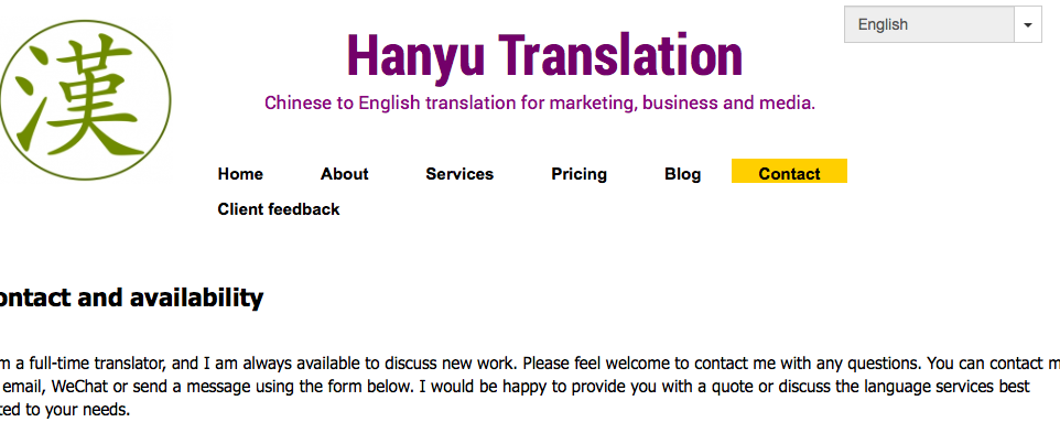
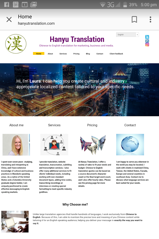
I just tried beta; unfortunately the formatting of the phone version on Beta is a total mess: please see the attached screenshots. The desktop version also has issues with the menubar - see third screenshot. I tried to lengthen the menu bar to fix this problem, as it does not look like this in the builder (it looks normal in the builder), but lengthening the menu bar did not do anything.
Right, so I would prefer not to use “Auto Layout.” I would like to use the wide and phone layouts, which are manual. However, when I have both wide and phone versions both set to “on”, the desktop version is not responsive, but the phone version is. That is to say, it looks correct on the phone, but it looks incorrect on the desktop version. Could you please advise on this issue?
The Auto Layout feature is indeed in beta, so I wouldn’t suggest using it unless it actually fixes the problem. Regarding the issue with the desktop version, can I ask you to provide some details?
If you can please screenshot which versions of the site you have enabled? If “wide” and “phone” are on, then this is a totally different issue. However, if “wide”, “desktop”, and “phone” (all three) are enabled at once, then I would suggest choosing between wide or desktop and disabling the other, because that has caused issues for me before.
My main problem is, I don’t want to leave it with both phone and wide screen enabled for days on end, as it looks very bad for desktop users, so I will turn off the phone portion again until I hear further notice. As I said, however, this is still a major problem I have no idea how to fix - seems like a major error with the system.
I had enabled the phone version and the desktop version. But when browsing on my large 10 inch Tablet at high (1536*2048) resolution I still got the tiny phone version presented as long as I kept my tablet in portrait orientation. Even setting “Desktop Version On” in Chrome didn’t help. Only if I switch to landscape do I get the desktop version presented.
What are the rules on the server side? Which client does it need to see before delivering the desktop version? It seems the phone version is preferred, unless the client reports a very large screen.
Until I find a solution to this, I have chosen to disable the phone version, which is not really satisfactory